Some biotech brands don’t just look good—they feel smart. Alloy Therapeutics is one of them.
They’ve built a name for themselves in the antibody discovery and platform space, but what we really love? They didn’t let complex science get in the way of great storytelling.
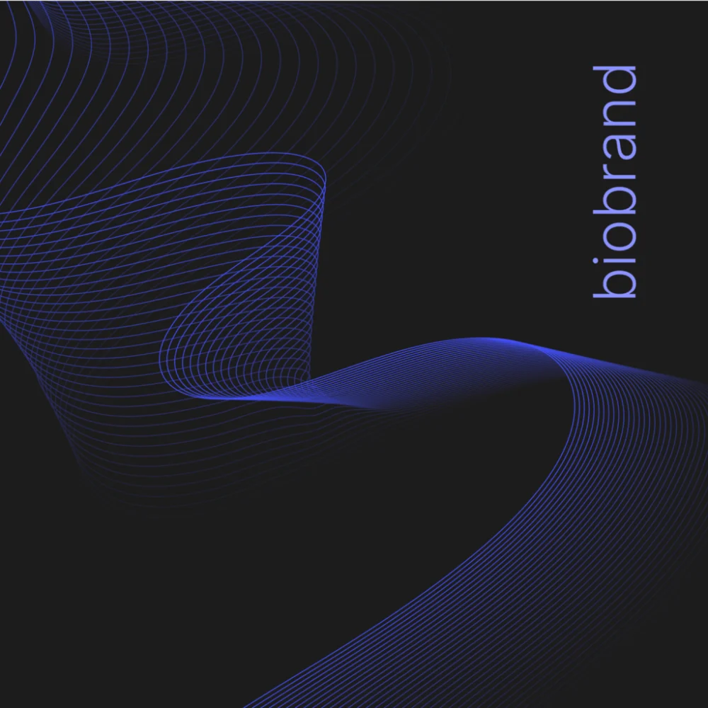
Alloy’s brand is vibrant, flexible, and feels like it’s actually in motion
What Stood Out to Us
- Color with Purpose: Their dynamic gradients and duo-tone color system reflect Alloy’s platform diversity. It’s visual storytelling at its finest.
- Custom Illustration Work: From “the blobs” (yes, they’re a thing) to abstract yet meaningful visuals, they managed to create a graphic language that feels both organic and scientific.
- A Site That Moves: Their redesigned website isn’t static—it engages. With interactive elements and smooth animations, Alloy turns browsing into an experience.
Consistency Without Being Boring
Alloy is one of those rare brands that maintains visual consistency while still leaving room to experiment. Every pitch deck, every booth display, every sub-brand feels like it belongs to the same family—but with its own personality.
Why We’re Watching Alloy
Because they get it. Branding isn’t just about looking polished. It’s about:
- Communicating complex ideas clearly
- Building trust with investors, partners, and talent
- Creating a design system that grows as fast as the science
And they’ve nailed it.
Behind the Scenes: Designed by Wizardly
While this isn’t our project, shoutout where it’s due: The team at Wizardly played a major role in bringing this brand to life—revamping Alloy’s identity, designing their site, creating pitch decks, and even animating graphics. Their work shows what’s possible when strategy meets execution.
Want more visual inspiration? Keep an eye on the BioBrand Story series—we’ll be sharing standout biotech brands worth watching, and what you can learn from them.
Know a biotech brand that deserves a spotlight? DM us—we’re always scouting for the next BioBrand gem.